
Multipurpose Tracker
What if the Forefathers of Organization —Reminders, Mint, and Google Calendar— each lent their best genes to a multipurpose tracking app?
Then, we’d have Tracker, a know-it-all (in a good way!) task manager promoting holistic organization while reducing app-switching fatigue.
User Experience & Software Development Studio (INFO 4340) | Cornell University | December 2018
Key Responsibilities: Market Research, Affinity Mapping, App Design and Prototyping, Design Rationale, User Testing Script and Interviews
The Team (Git and Tonic): Isabelle De Brabanter | Jungwon Shin | Grace Song | Jeffrey Tsang | Angela Zheng | Priya Kankanhalli
Background
Pop quiz! What’s my name?
There’s quite a lot to remember in our Age of Information, but we forget 70% of the new information that we’ve encountered within one day of exposure.
According to the Ebbinghaus Forgetting Curve, the relationship between retention and time-since-learning is an unhappy one. Granted, the statistics are less severe when information is contextualized with personal relevance and repetition of exposure, but, nonetheless, there is a pressing problem space here.
Intrigued by the ease of forgetting, Git and Tonic banded together in Software Development Studio and set out to design a memory aide to help humans forget about remembering logistics. Tracker was meant to enable retention of abstract concepts —not only as an organizational tool, but also, more importantly, as a device through which to share the burden of memory.
The best products are built with empathy… and who better to empathize with than ourselves? We designed Tracker for the typical college student, pelted with deadlines while wrestling with the demands of daily life. Tracker aimed to release time and energy spent remembering academic, medical, and financial responsibilities.
User Research and Problem Definition
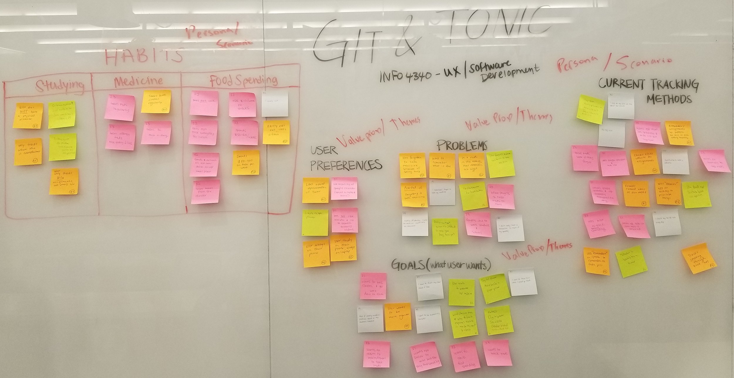
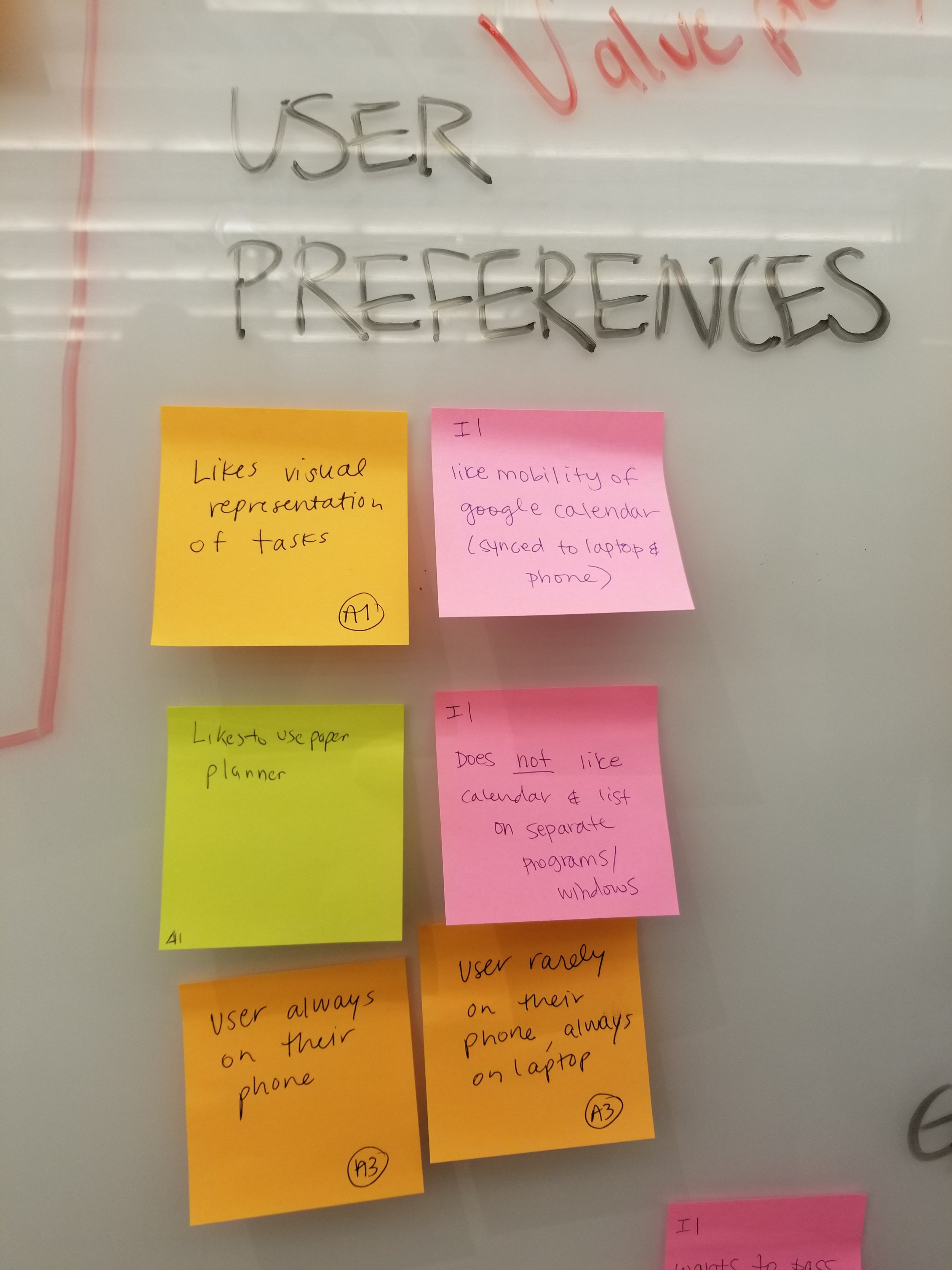
To understand our target audience and the patterns in their challenges, we grouped common user problems, goals, and preferences into an affinity map. This surfaced 3 clusters of information that students regularly struggled to remember: responsibilities related to studying, taking routine medications, and managing spending. These later became the 3 pillars of Tracker.
Our user research also explored existing tracking methods that students employed. We learned that students relied on an assortment of applications to monitor various tasks, budgets, and deadlines. Ironically, this led to individual tasks being overlooked in the midst of multiple entry points and application-switching. Cue Tracker, offering one-stop organization through a familiar interface.


Early Sketches
Behind every great design is a stack of papers bleeding Sharpie ink.
We began to visualize Tracker by sketching out many, many sample screens and features (a small subset is pictured below). Ideas from each team member were evaluated against Tracker’s key goals.
We gained some insights from this stage of the design process:
Not all imagined features can —or should— be translated into reality. It’s helpful to discover this at the onset.
Defining the navigational structure of an application and mapping sketches back to key requirements ensure alignment with overall goals.
Sketching helps facilitate communication between designers and coder, even if messy! Sketching sparks discussion around the feasibility and complexity of desired features.
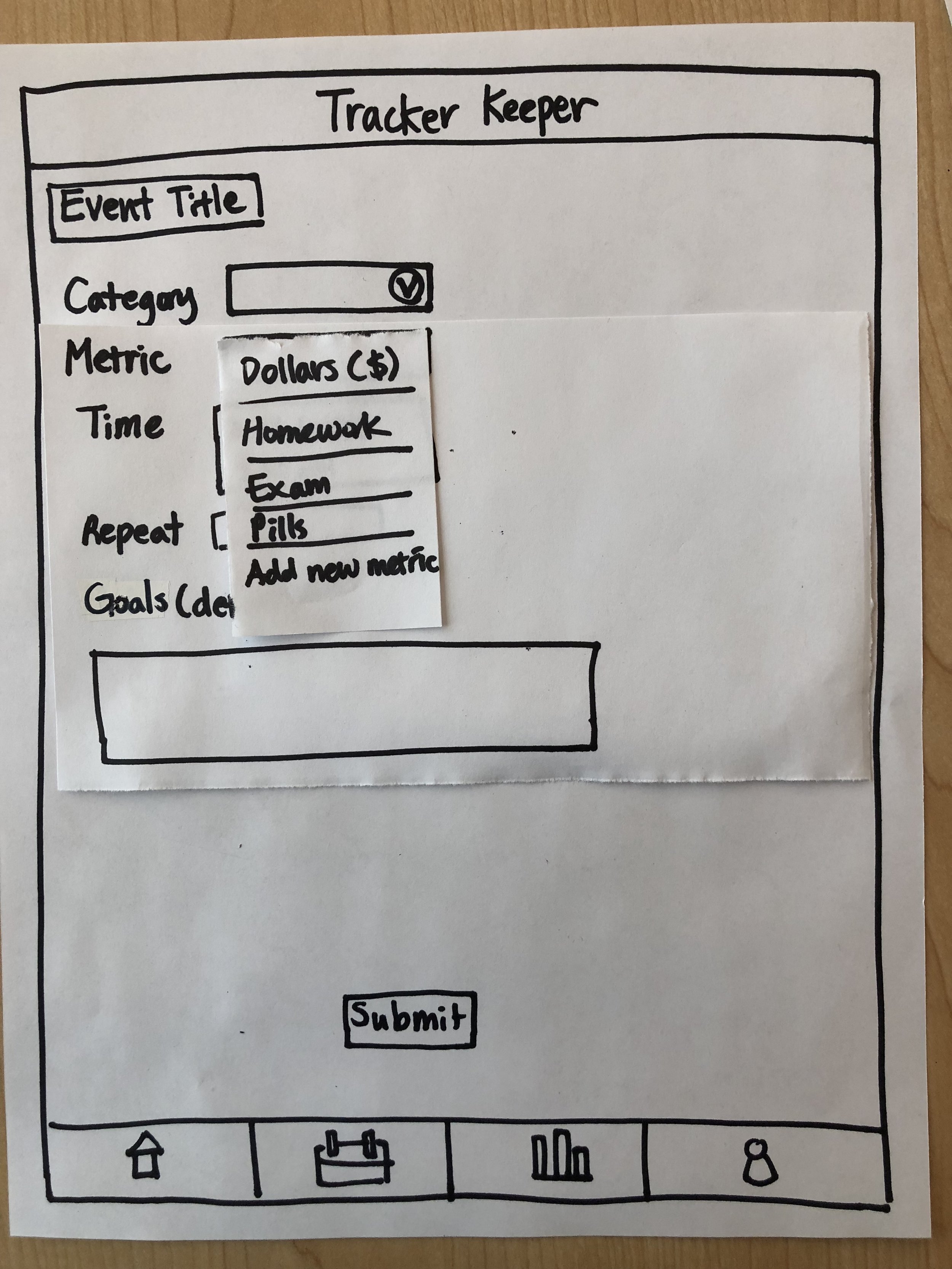
Prototypes
With rough sketches of the screens of Tracker, we were free to create a medium-fidelity prototype.
In this stage, we refined the extent of possible user actions and enabled a smoothly-flowing user journey. We also began to form opinions on the UI and layout of each screen.
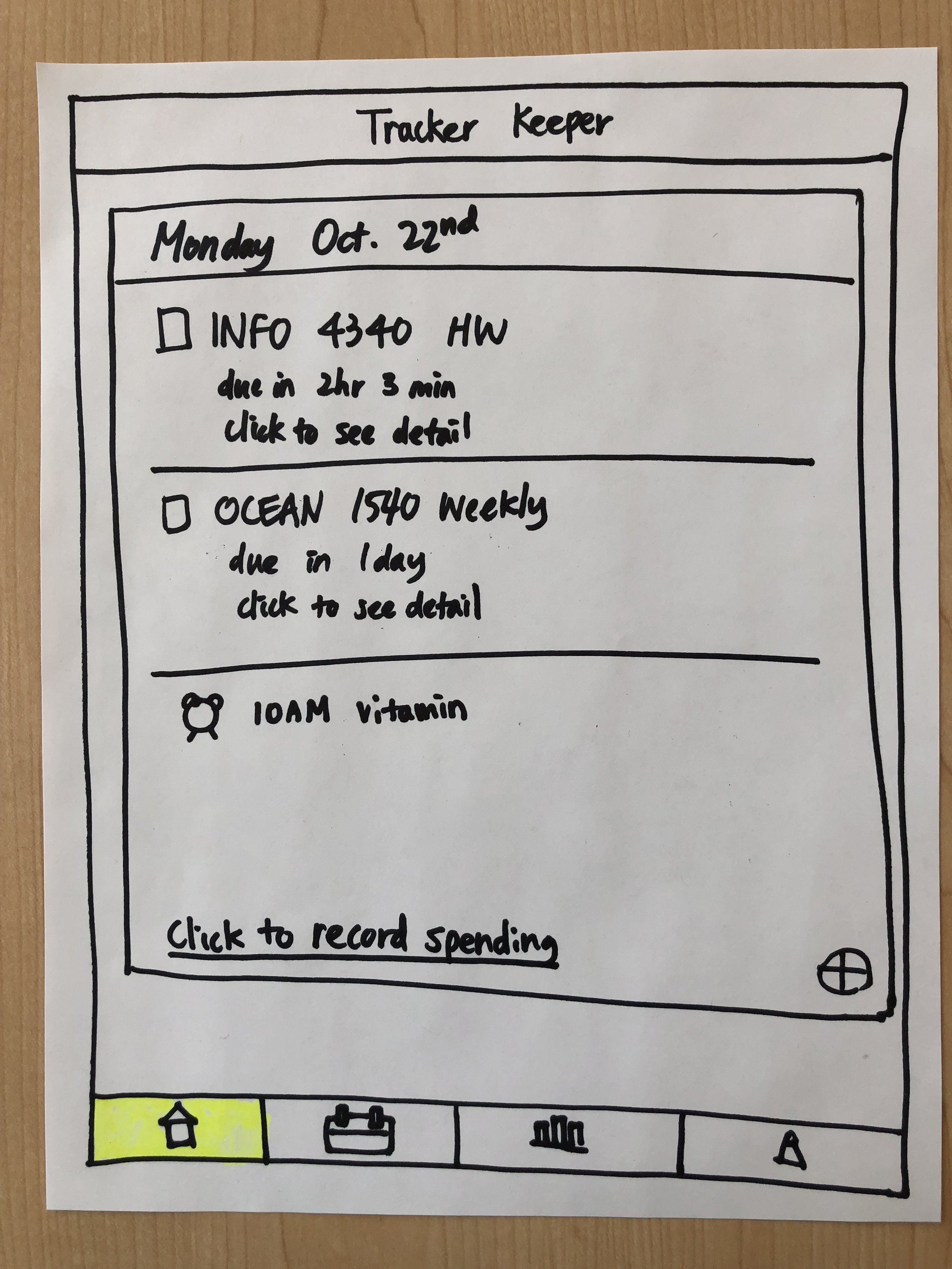
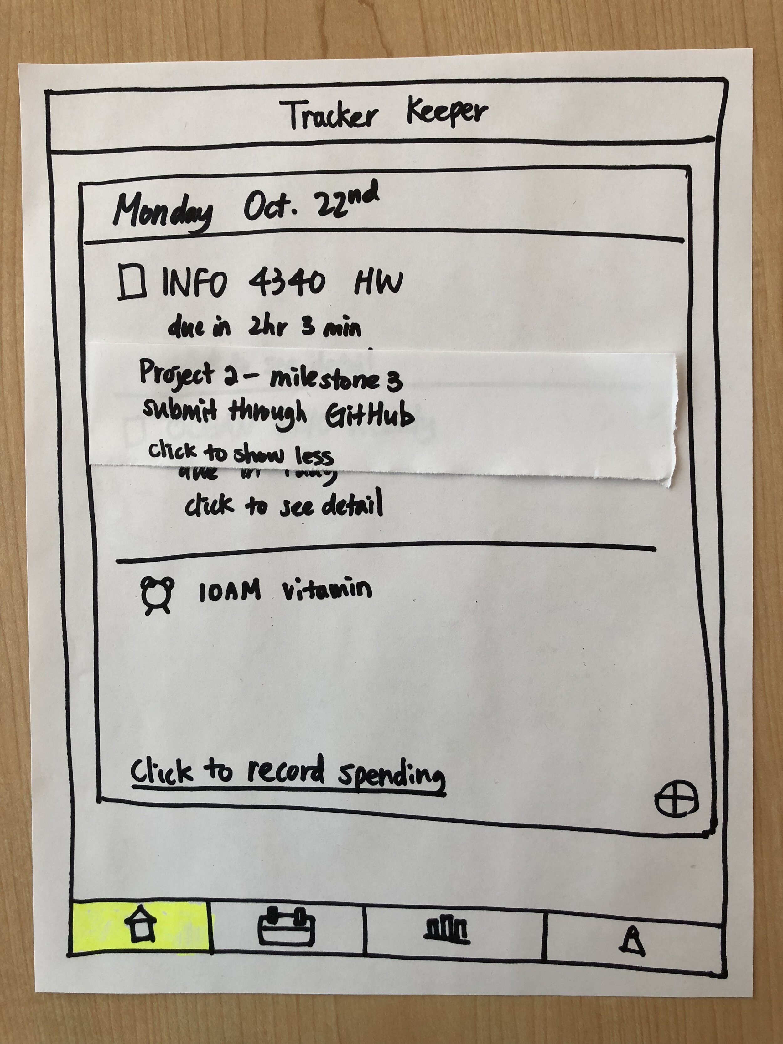
Even in the short span between sketching and prototyping, we revisited our design rationale and decided to exclude certain features from the latest iteration: the “Click to See Detail” drop-down on the Home screen, “Metrics” drop-down on the Task Input screen, and pie chart on the Reports screen among them.


User Interviews and Design Iteration
After prototyping came validating.
Of course, Git and Tonic thought the world of Tracker, but we had to be sure the world agreed. So, we embarked on ~12 user interviews with a standardized script and action-based prompts. Our goal was to discover which features in our design were intuitive and effective, which ones weren’t, and how to bridge the gap.
Sample Prompt: Suppose you want to remind yourself to run for 1 hour later today. You don’t think that this fits any of the existing categories. How could Tracker help?
Expected User Journey: Follow the guidance that clicking the “Add New Category” button gives. Then, enter running for an hour as a task under this newly-created category.
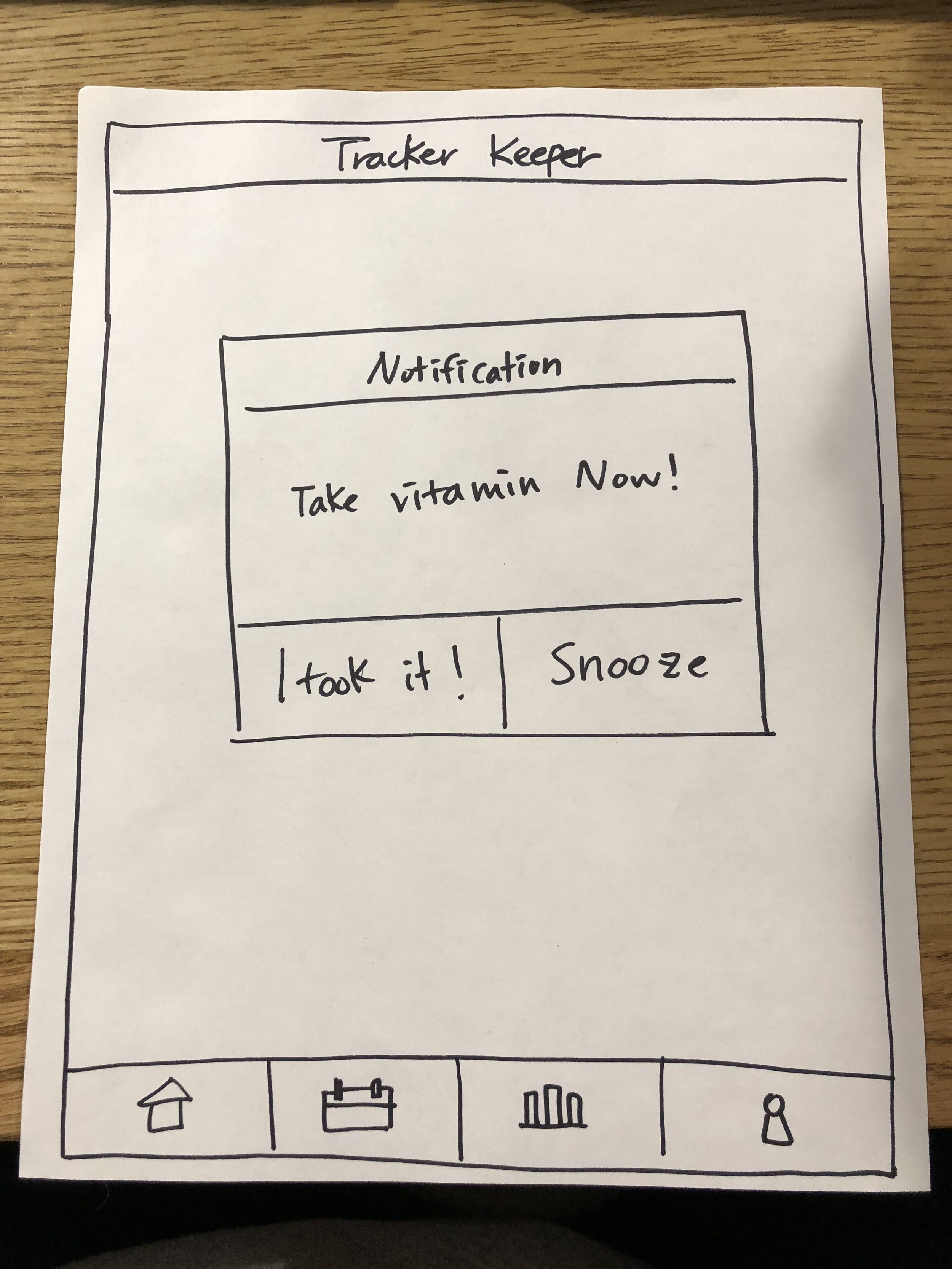
Sample Prompt: Suppose you normally take daily vitamins after lunch, around 1:00pm, and you don’t want to miss a day. You’re not willing to enter this into Tracker every day, but you want to see it every day. that it appears on your list consistently without having to manually repeat task input. How could Tracker help?
Expected User Journey: Use the “Repeat” functionality within the Task Input screen to add daily recurrence to taking vitamins.
Final Design
All of the steps described above led us to a set of intuitive, user-friendly screens that solved for our original goal: helping our peers forget about remembering the little things.
Our MVP included features supporting the creation of various types of tasks, customization of task frequency and timing, as well as visualization of aggregate trends to promote self-awareness.

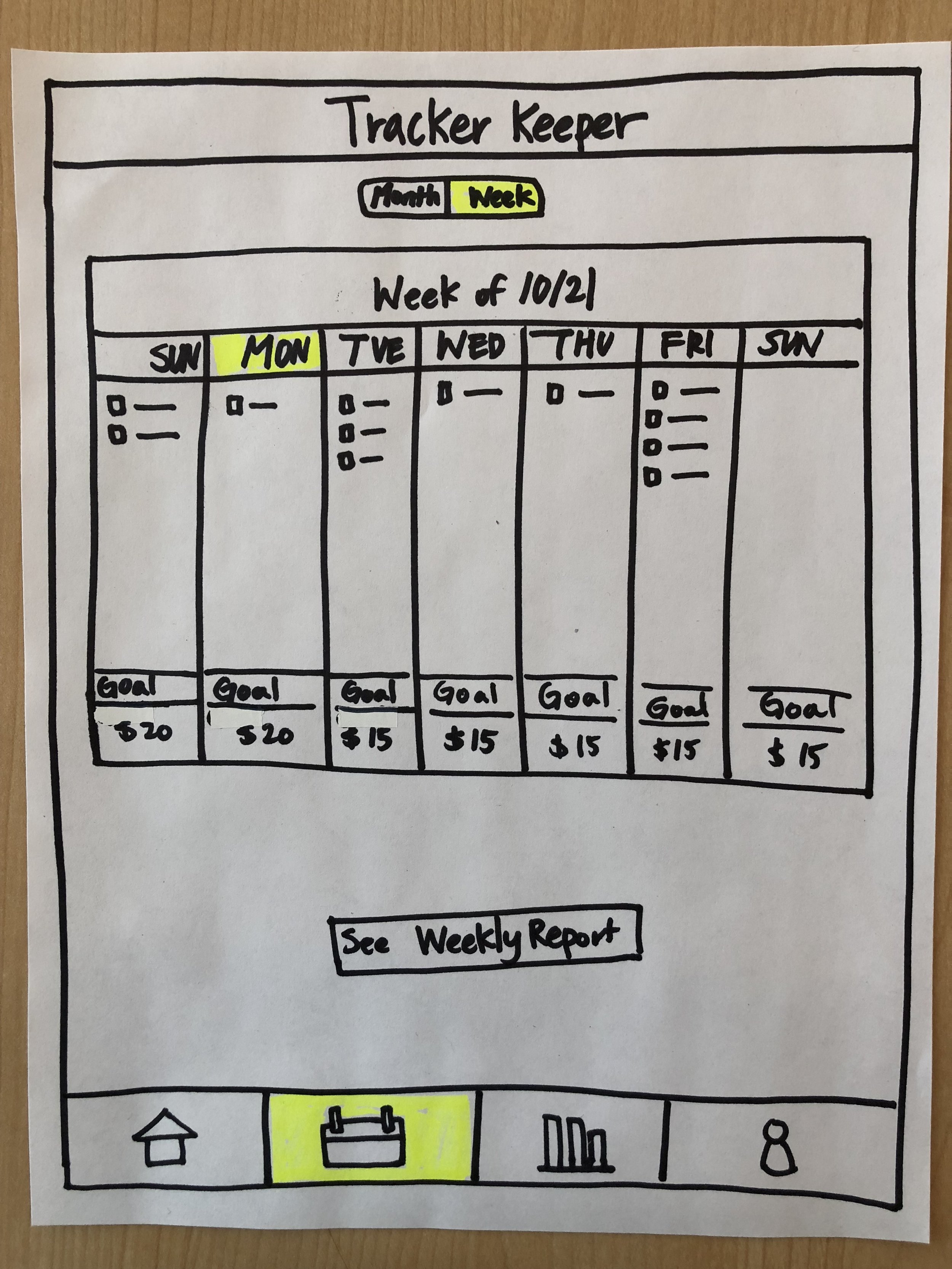
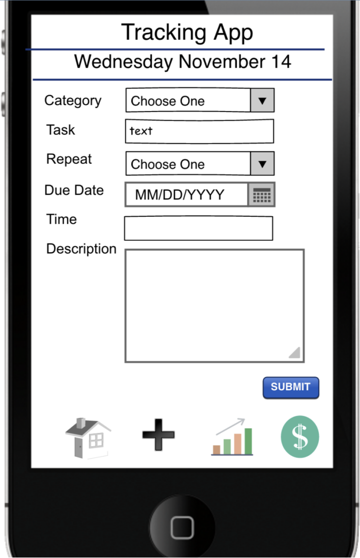
Task Input Screen
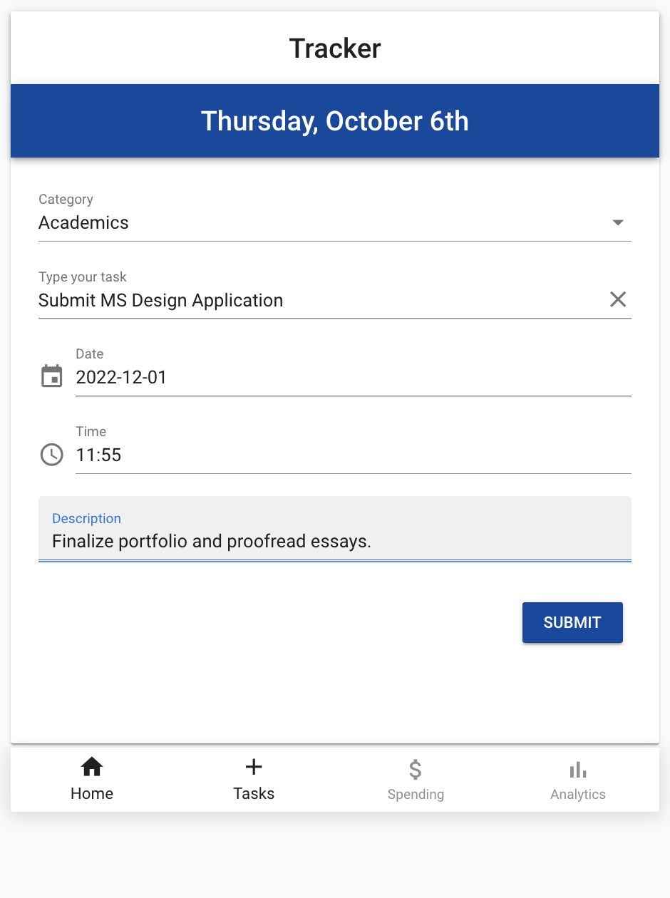
Academic Task Entry

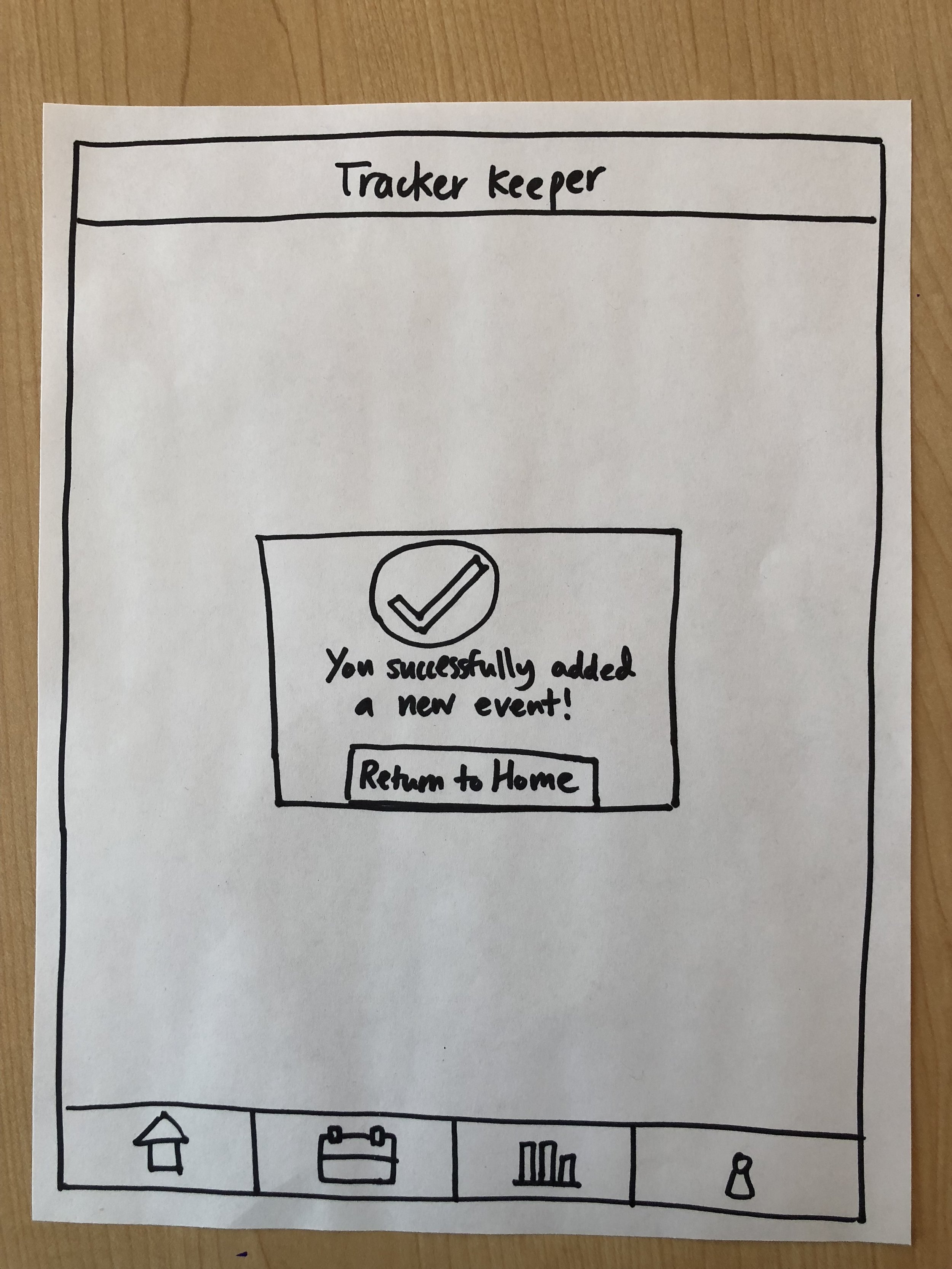
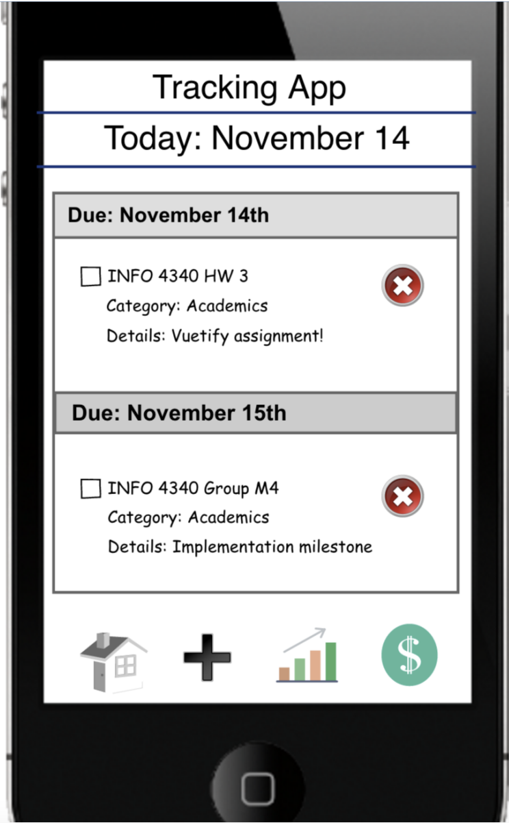
Successful Task Entry to Master List on Home Page
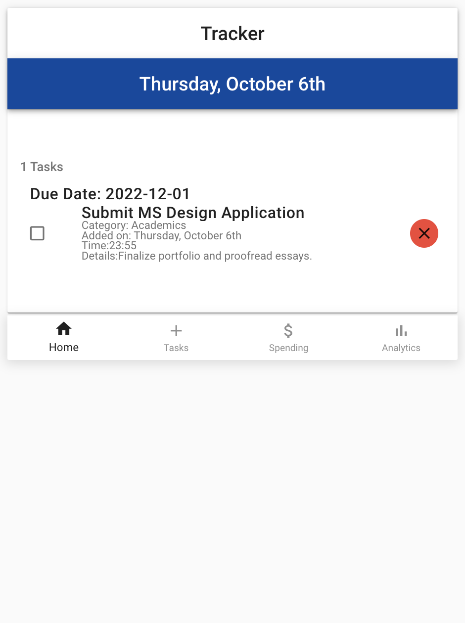
Master Task List, with Completed/Delete Options

Home Page with Medicine Reminder, Academic Task

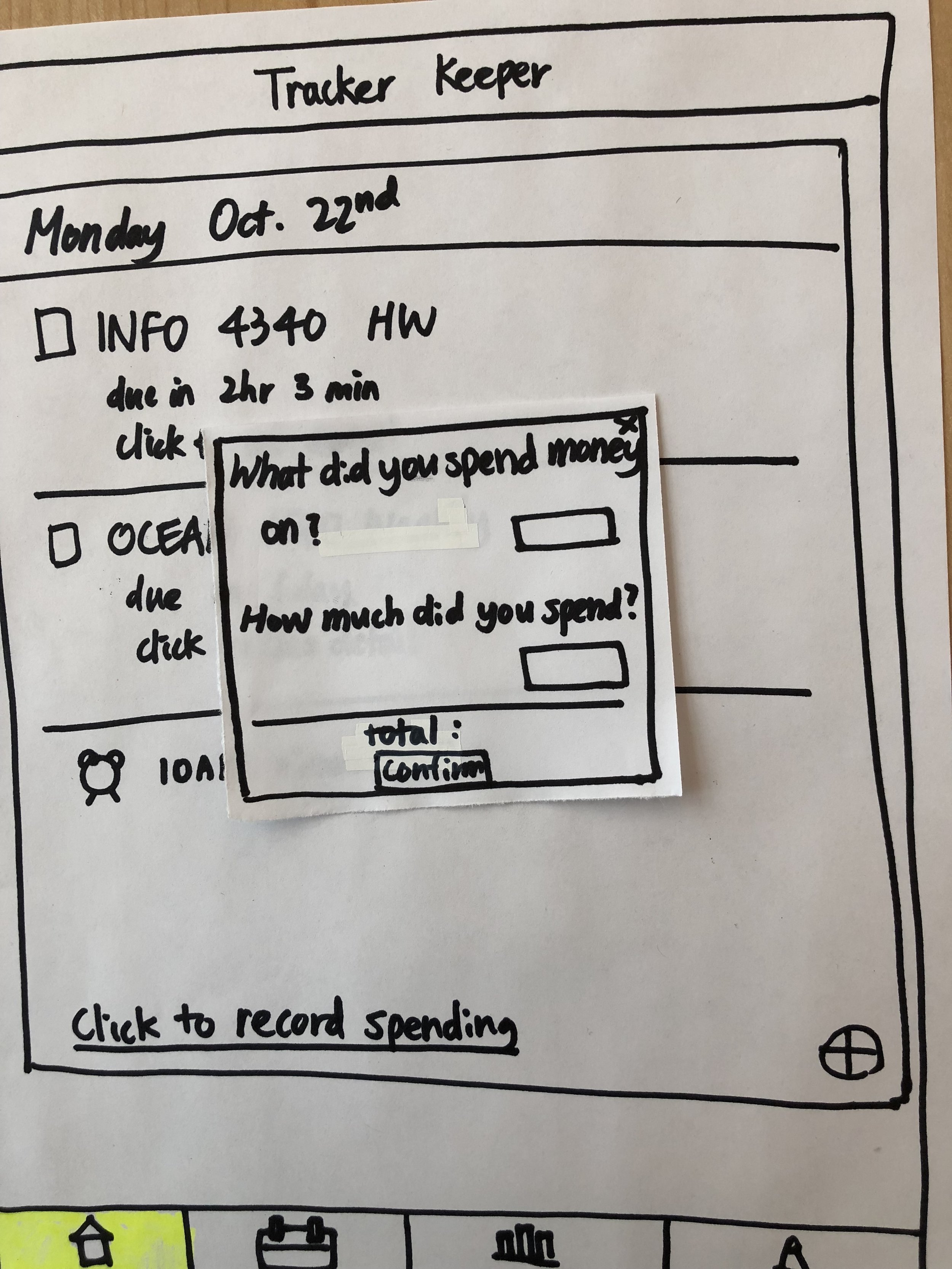
Spend Tracking Screen

Task Marked as Complete

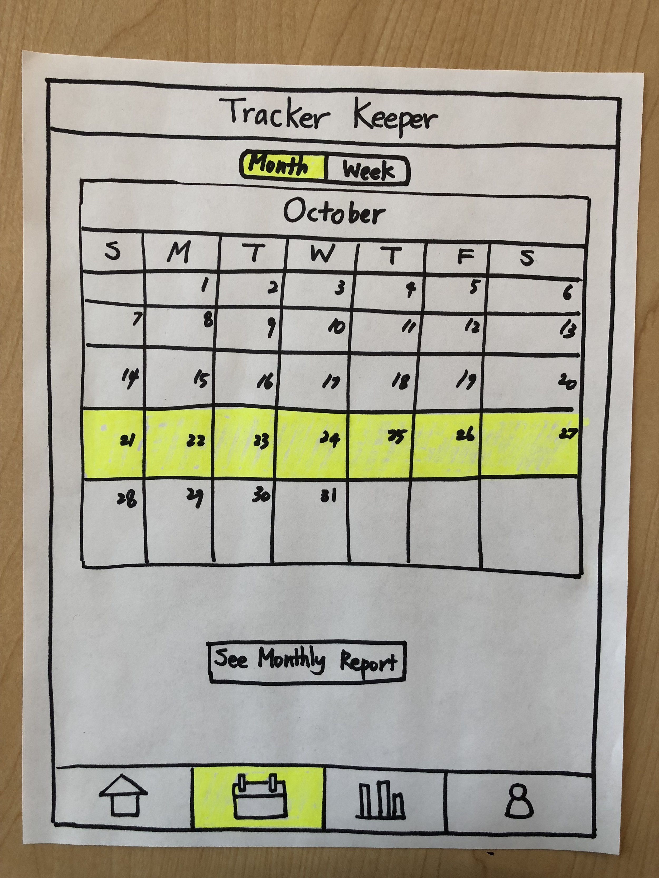
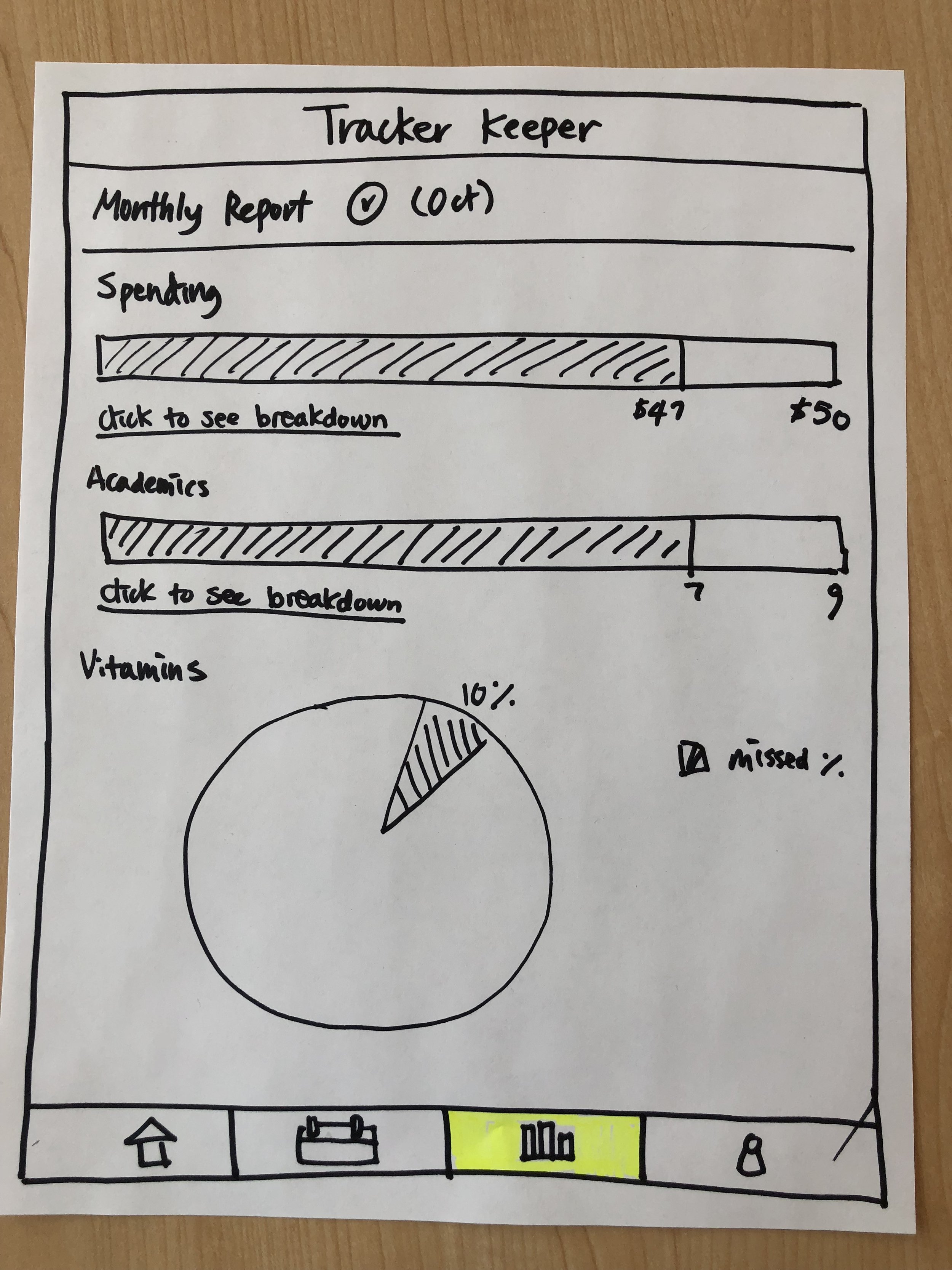
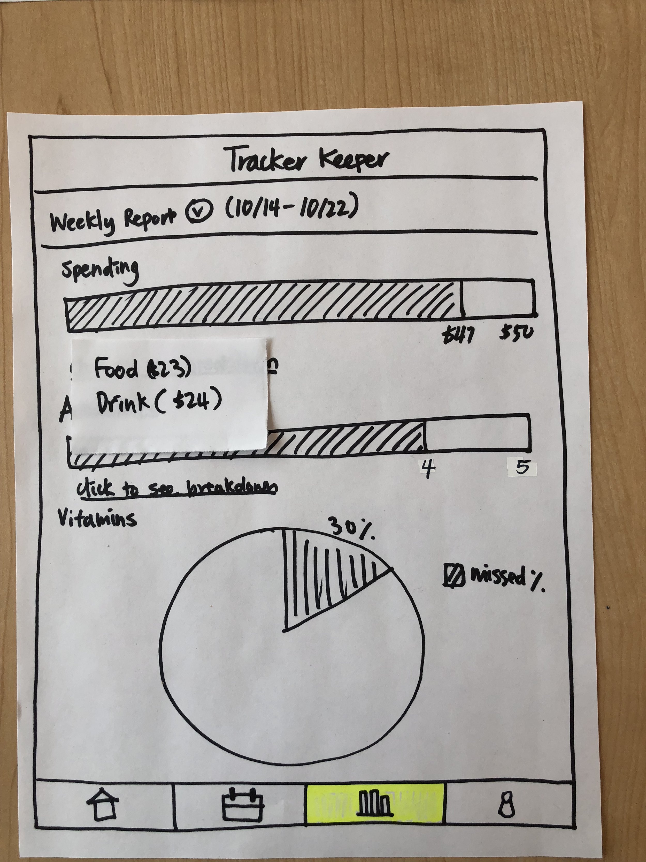
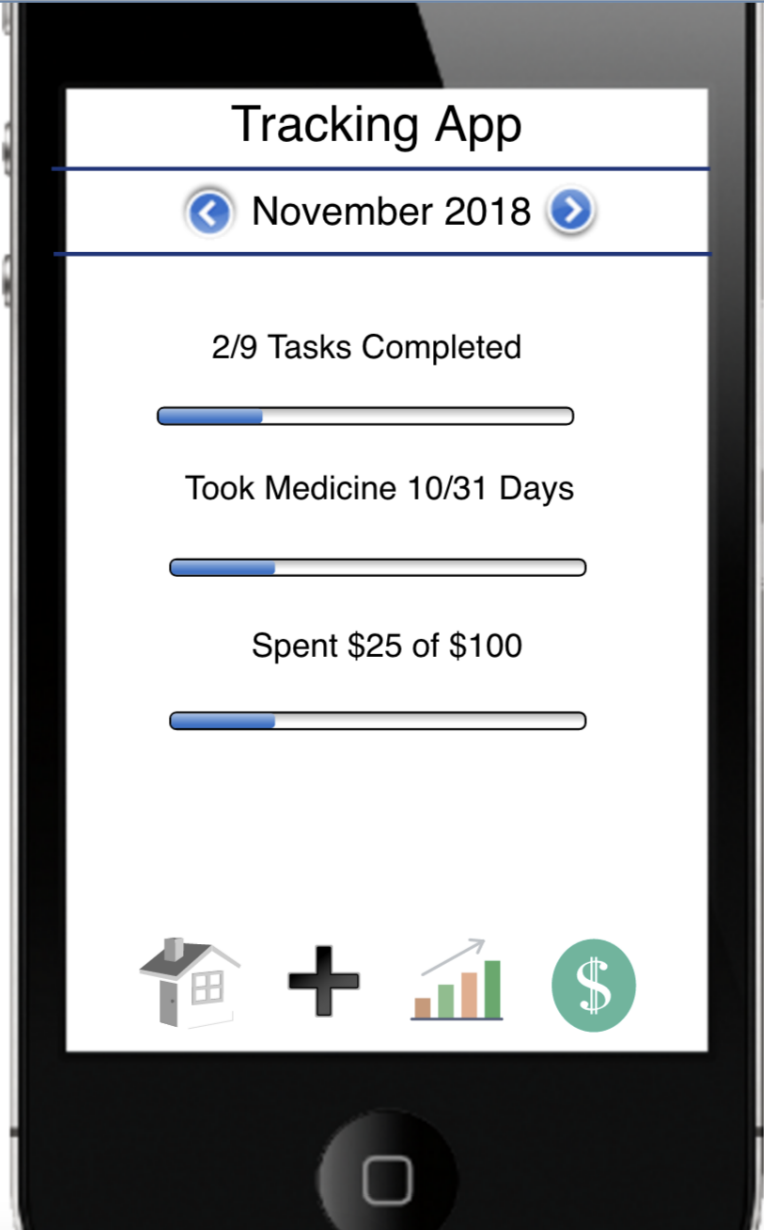
Analytics Screen, with Task Progress for October
In Hindsight…
Having had several years to mull over the design and implementation of Tracker, I see some room for improvement.
Here’s a non-comprehensive list of items that might make Tracker more marketable and effective in its purpose.
Give Tracker a catchier name. Sometimes, single-word, no-frills application names fare well, but a jazzier name would distinguish Tracker from its competitors.
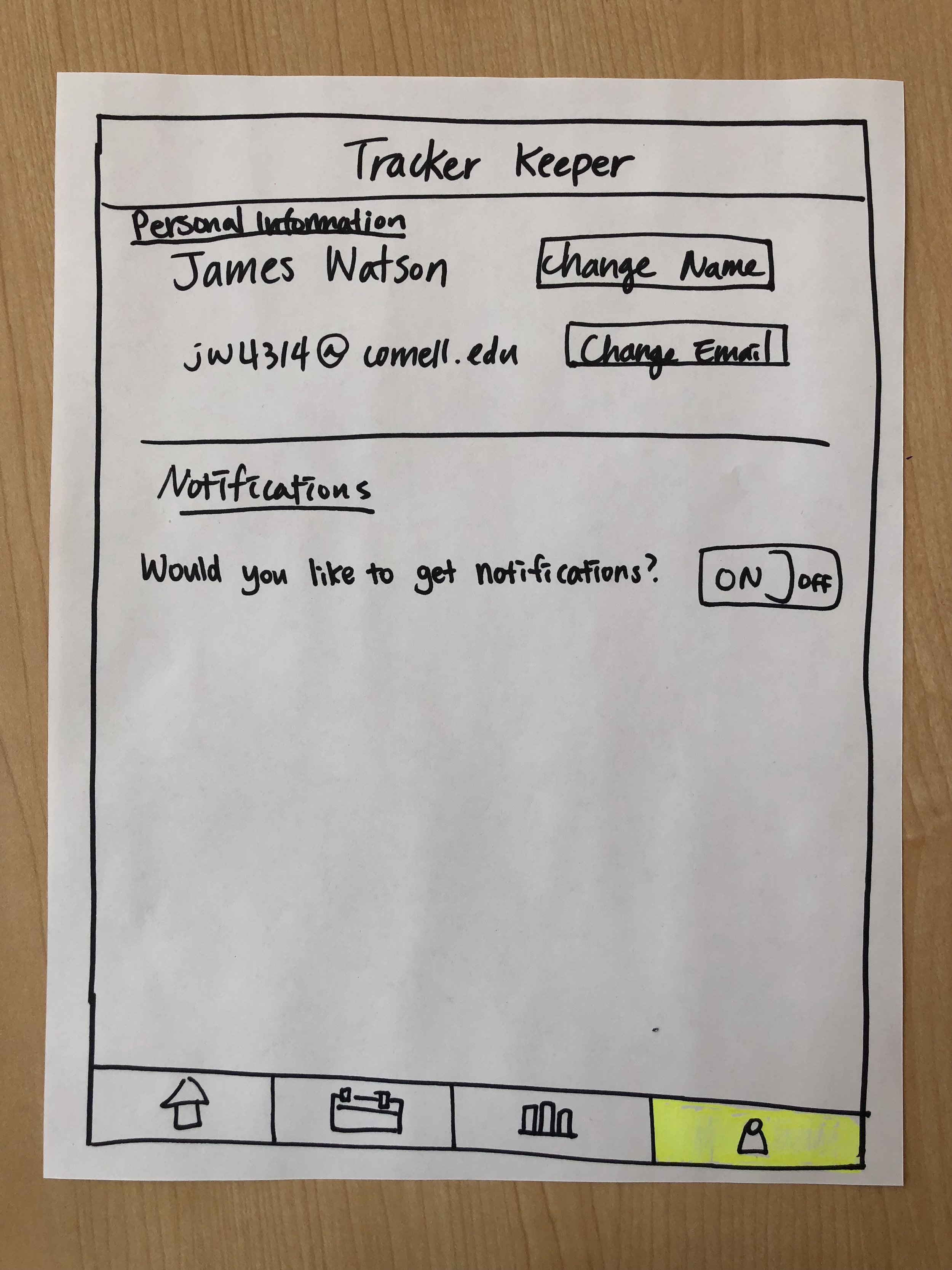
Update the coloring of the “Home” button in the bottom navigation bar to match the non-active tabs.
In our final screens, “Home” is constantly darker than the remaining 3 navigation buttons. This color-divergence confounds a whether “Home” is his current placement, per UI standards.
Create a clear association in the Analytics tab between the analytics being displayed and the units of measurement.
In the current state, the user may be forced to ask: does “Medicine 1/1” mean number of medicines or numbers of times per day medicine was meant to be taken? Does this factor in recurrence?
Fix the “Repeat” functionality so that it does not display X instances of a single task on the Task Input screen (bug not pictured). This functionality is meant to add a task only once to the Home screen and signal that it is repeating.
Include guardrails to promote healthier usage of Tracker. For example, consider blocking a user from setting a December budget in September to minimize confusion on the Analytics tab.
Overall, I have renewed belief in the necessity for Tracker, but there is work to be done to guarantee that all of its features coexist peacefully and productively.
To our credit, though, I still love the calm blue that we chose for our UI. Cheers, Git and Tonic! 🥂