
Blackstone Investor Portal Login Redesign
Product Manager | Blackstone Technology & Innovations | April 2020
Key Responsibilities: Competitor Analysis, Process Flow Documentation, UI Design, HTML/CSS Review, Feature Launch, Driving Adoption
The Challenge
First impressions rarely come with second chances. So, a Limited Partner’s (L. P.) experience while logging into the Blackstone Investor Portal —his introduction to Blackstone’s digital footprint— was in dire need of a revamp.
L. P.s commit millions in capital to Blackstone funds and regularly visit the Investor Portal, BXAccess, to monitor their investments, download fund documents, manage account and legal preferences, and respond to capital calls. Redesigning the login experience had the potential to serve Blackstone’s existing L. P.s and attract new ones, increasing ease-of-use for one and all.
In my role as a Product Manager at Blackstone, I asked myself: how do I leverage UX principles to position Blackstone as a technology-forward, trustworthy firm that offers a hassle-free, reliable view into all investments*?
*investments that made me think, “I didn’t know that a number could have so many zeroes.”
The Solution
I modernized the Blackstone Investor Portal login experience and brought in subtle but effective design anchors to promote feelings of trust and enthusiasm in L. P.s.
Aware that L. P. trust is rooted in security, I coupled the login experience upgrade with the launch of 2-factor authentication (2FA) via Twilio, enabling L. P.s to safeguard their data. Launching this brand-new feature required close collaboration with Engineering and L. P. Relations.
To fuel design iterations, I studied login experiences of competing Private Equity firms and identified successful and unsuccessful UX themes across the industry. I created prototypes and process flows* on Adobe Illustrator and Lucidchart for internal review, and I surveyed L. P.s at the close of the project to validate the final design.
*due to confidentiality agreements with Blackstone, I am unable to publish early prototypes and process flows.
Out with the Old…
Prior to 2020, the BXAccess login page was functional, but it was not beautiful or trust-inspiring.
It offered self-serve username and password recovery features but lacked 2FA capabilities and FAQs. The presence of Blackstone’s brand was minimal at best.

Competitor Analysis
| Brand Presence | Grand Background | Centered Inputs | Username Recovery | Password Recovery | "Remember Me" Toggle | General Help | |
|---|---|---|---|---|---|---|---|
| KKR | Strong | Yes | Yes | No | Yes | Yes | Yes |
| Apollo | Weak | No | Yes | Yes | Yes | No | Yes |
| Thoma Bravo | Weak | No | Yes | Yes | Yes | No | Yes |
| Carlyle | Strong | No | Yes | No | Yes | No | Yes |
| TPG | Weak | Yes | Yes | Yes | Yes | No | Yes |
| Warburg Pincus | Average | Yes | Yes | Yes | Yes | No | Yes |
Investigating the login flows of 6 of Blackstone’s competitors, I built the above feature comparison matrix. I narrowed in on UX concepts and UI elements that are consistently leveraged across the most inviting login pages:
-
Investors may struggle to part with large sums without the implication that their investments will lead to greater fulfillment or substantial influence.
It is critical, then, for wealth management firms to evoke a larger sense of purpose in their investors.
KKR and TPG infuse grandeur and powerful imagery into their login experiences, transporting their investors to dazzling settings.
This unlocks a subconscious linkage between an investor’s funds and wide-reaching, memorable impact. -
Empowering users to instantaneously and independently resolve conflict minimizes chances of distraction and abandonment.
All 6 competitors offer online password recovery flows, while all but KKR and Carlyle offer username/email recovery flows.
Though Apollo readily provides username and password reset flows online, 1-on-1 support is also easily accessible.
Blackstone incorporated the same flexibility to serve a wider audience.
I also observed some design choices that created friction in the user journey:
-
Placement of the firm’s logo in the top-left of the webpage is standard; however, this peripheral placement delays users’ association of a webpage with the relevant firm.
This understandably detracts from users’ confidence and likelihood of investment.
KKR and Carlyle effectively utilize the center of the webpage to boldly proclaim their brand names.
Immediately, users are reassured that they’ve landed on the intended page and are entering a portal to a firm that embraces its reputation. -
KKR tactfully shrinks the effort of reentry and establishes the act of logging in as a routine, low-barrier process through its “Remember Me” checkbox.
With a system’s cooperation, users need not spend time or energy recalling credentials.
Over time, repeated reinforcement that saving login credentials with a website causes no harm builds trust between users and brands.


In with the New…
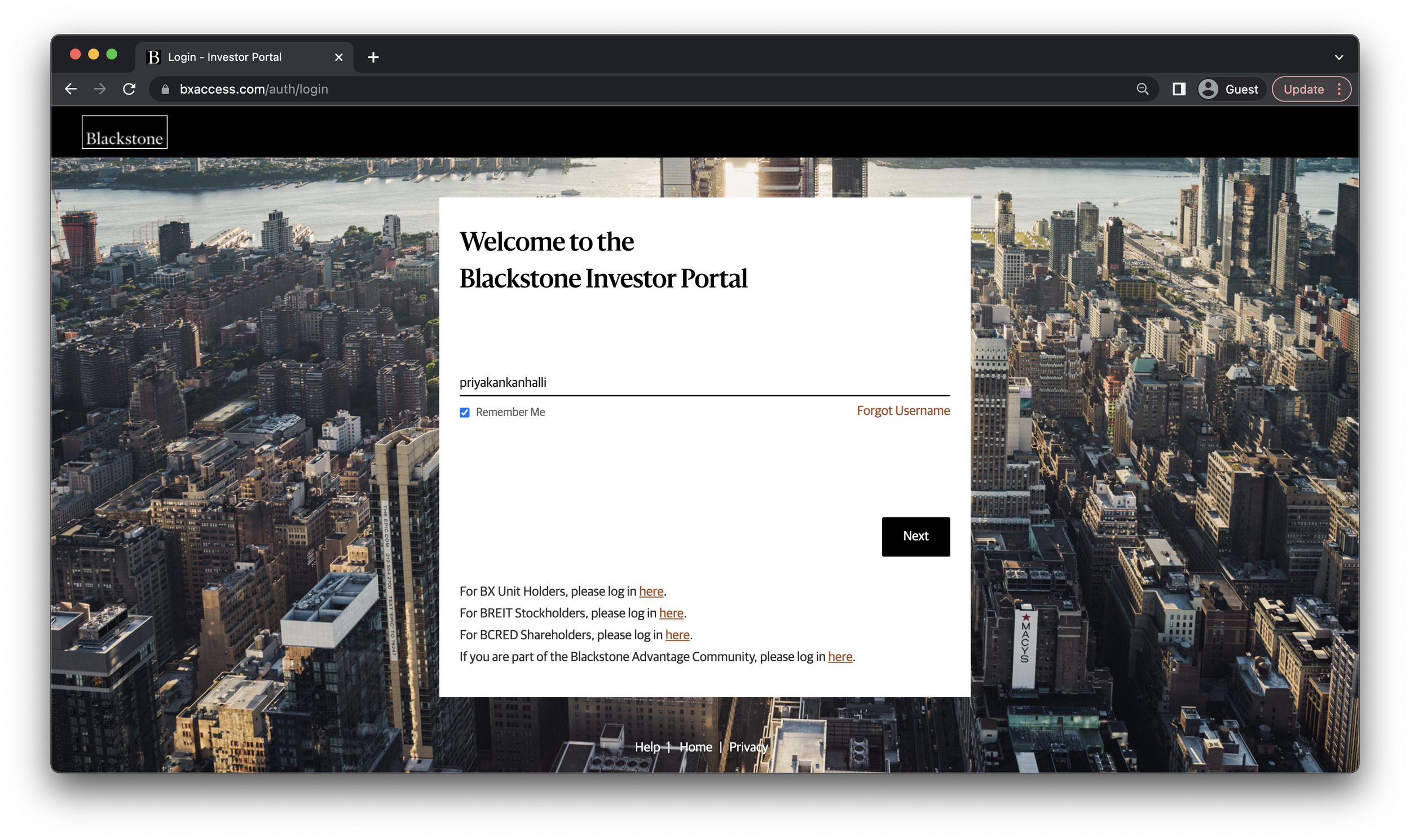


We did it! Through hours of collaboration and iteration, my team and I launched the new-and-improved Blackstone Investor Portal login experience in April 2020.
In addition to employing proven UX tactics like a grand background and strong brand association, we:
Added links to customized login experiences for investor sub-groups (e.g., BX Unit Holders, BCRED Shareholders).
Implemented 2FA to increase trust and security (with information on updating 2FA devices conveniently located in the FAQs!).
Our research showed that investors typically logged into the Blackstone Investor Portal via desktop. However, we also delivered a mobile-friendly login experience to accommodate edge cases as well as exhibit consistency and accessibility. The same design findings above drove our redesigned login experience on mobile.
L. P. Satisfaction Survey
At last, the team circulated an L. P. Satisfaction Survey to over 6,000 Blackstone L. P.s to understand the reaction of the user base to the redesigned login experience and identify areas for improvement.
While the login page was not the sole focus of this survey, we received guidance on the Blackstone Investor Portal as a whole from high-net-worth individuals and multi-client investors. Before this, the last L. P. Survey was circulated in 2016, over 4 years prior.
84%
of L. P.s find BXAccess equally or more intuitive than other portals
300+
responses received
90%
of L. P.s find BXAccess equally or more detailed than other portals
Key Takeaways
Design is subjective. Research is objective.
Every contributor has unique and valuable opinions about visual, spatial, and emotional elements of a design. Some will champion rounded buttons, serif fonts, and a surplus of whitespace, while some will champion the exact opposite. Only tangible, objective evidence from research on industry trends and tried-and-tested design practices can combat this well-intentioned subjectivity.
Simplicity isn’t simple to create.
My guiding principles in redesigning the BXAccess login experience were simplicity and ease-of-use, yet, there was no shortage of nuances to integrate into the overall strategy. While it may seem that a username field, a password field, and a login button are the only non-negotiable components of a login page, we identified countless forks that users could subject themselves or be subject to on a login journey. Expecting the unexpected in advance helps designers create additional functionality that third-party observers might view as simple and effortless.
No detail is too obvious to exclude from documentation.
Collaborating with the Engineering team to breathe life into the revamped login experience was tricky but rewarding. At times, what felt like a glaring CSS error to me was hardly on my developers’ radars, and what felt like a blatant gap in specifications to my developers was a “Duh!” moment for me. Lesson learned: it’s unfair to expect others to find obvious the same details that I do. Explain as much as possible in the first go.